Sociology Ph.D. Student’s Exhibit Inspired by W.E.B. Du Bois

This month I got to speak with Davion Washington, who is a first year graduate student in NC State’s Sociology Ph.D. program. Davion Washington was able to work on a visualization project, which is a graphic representation of data. This particular project was inspired by the work of sociologist and civil rights activist W.E.B. DuBois, that was shown in the James B. Hunt Jr. Library. When he began his work in sociology, Davion was “fueled” and inspired by the works of W.E.B. DuBois, so being involved in this project allowed him to work closely with topics that meant a lot to him.
Washington’s prior research was mainly qualitative, but through the SOC 713 course he was able to delve into the quantitative style of analysis. This form of research was utilized during the visualization project, which was an extension of Davion’s previous work that focused on the experiences of African American students at predominantly white institutions.
There are several tools used to collect data for the visualization process. The graphing tools in “Stata Software” were used to state the initial proposal of the project, which was an area graph that shows proportional differences of African American students. This area graph was modeled after an area graph created by W.E.B. DuBois, which showed the proportion of free men and slaves. Tableau Software was also used in the creation of the pie charts that were presented.
Davion thanks Alex Yoshizumi for helping him learn about the presentation of data through this program. To Davion’s surprise, a large portion of the final product submission was done in Microsoft Excel and PowerPoint, and he was able to discover numerous fascinating tools that these softwares had to offer.
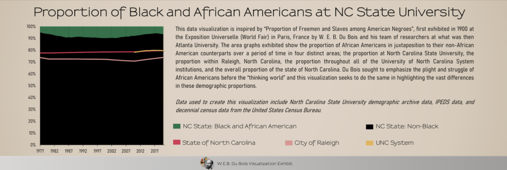
The findings of this project are important to discuss. The area graph showed a significant increase during the years 1975-2000, where the African American student population peaked at about 9.9% of North Carolina State University’s student body. Some points on the timeline can be explained by African American advancements throughout NC State’s history such as, the first African American “leader of the Pack”, introduction of African American fraternities and sororities, and the first African American student body president. After the year 2000, the number of African American students, compared to that of white students, decreased with the number being roughly 6% by the year 2020.
The latter half of the timeline showed a lot more “division and hostility” as described by Davion Washington. It was characterized by racial divisions and hate crime incidents that occurred on campus, such as racial slurs being painted in the free expression tunnel during Barack Obama’s presidency and leaked group chat messages containing racist comments.
Showcasing this data through visualization allows it to reach an audience that may not have previously been able to interact with this information.
“Data seeks to tell a story,” says Davion Washington, who is dedicated to being a public sociologist.
This way, people can see the data that he works with and understand the story that he is trying to tell. Visualizing the data allows for individuals to draw their own conclusions about what is being presented to them in a way that’s more accessible than scholarly articles and other resources in academia.
“It’s a tool that can present information to the masses.”
There is an archive website through NC State University libraries that shows a timeline representing black history in the state of North Carolina and its university systems. The link can be found here: https://historicalstate.lib.ncsu.edu/timelines/african-americans
This post was written by Justice Cass, a Department of Sociology and Anthropology Student Ambassador pursuing a degree in sociology and a minor in English.

- Categories: